
CSS white labeling
Anvil Workflows and e-signature packets can be styled to match your brand. By providing a custom CSS stylesheet, you can completely control the look and feel of your Workflows or e-signature packets.
We support 2 methods of white labeling:
- CSS variables: The easiest way to style your Workflow or packet. We have a set of CSS variables that you can override to change nearly all relevant styles. This method is the easiest way to get started with white labeling.
anvil-*CSS classes: For more granular control, you can use ouranvil-*CSS classes to style individual elements. We have a set of classes you can target in your stylesheet so you can directly style specific elements.
In some cases you can combine both methods to style your Workflow or e-signature packet to achieve a quicker and more effective stylesheet.
White labeling with custom stylesheets is a Custom plan feature. To learn more, please visit the pricing page.
Workflow white labeling
This guide will walk you through the process of white labeling a Workflow. We will use Anvil's white labeling system to style a Workflow to match your brand.
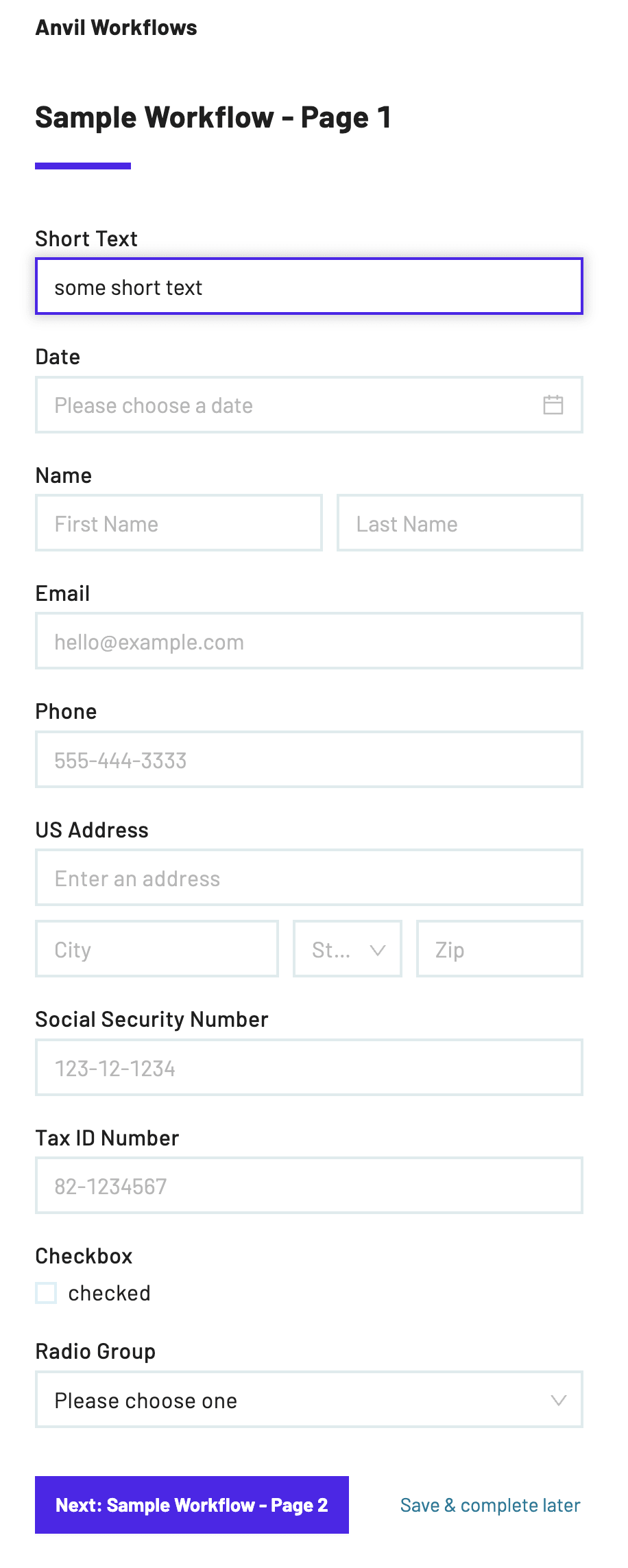
Let's take the Sample Workflow as an example. Here's a screenshot of the Sample Workflow, unstyled:
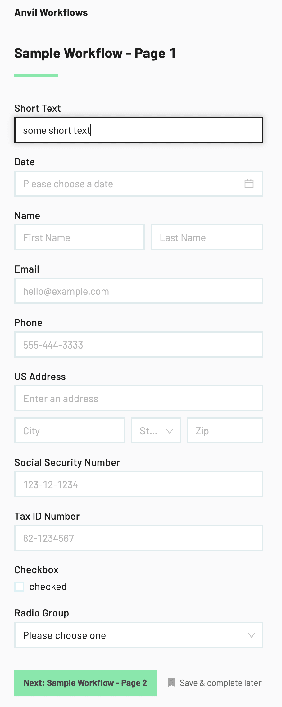
Anvil's default styling for a Workflow - this is what you get out of the box
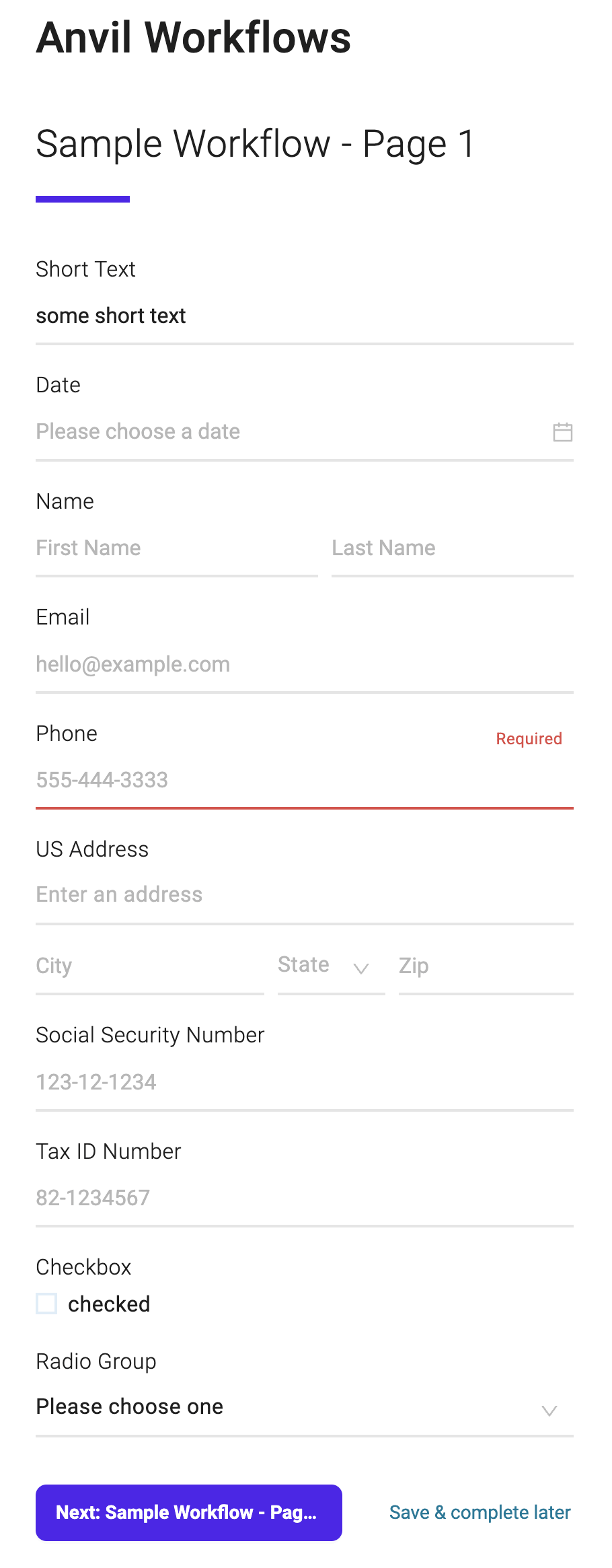
And here's a screenshot of the Sample Workflow, styled with the Material theme stylesheet that we will build in this guide:
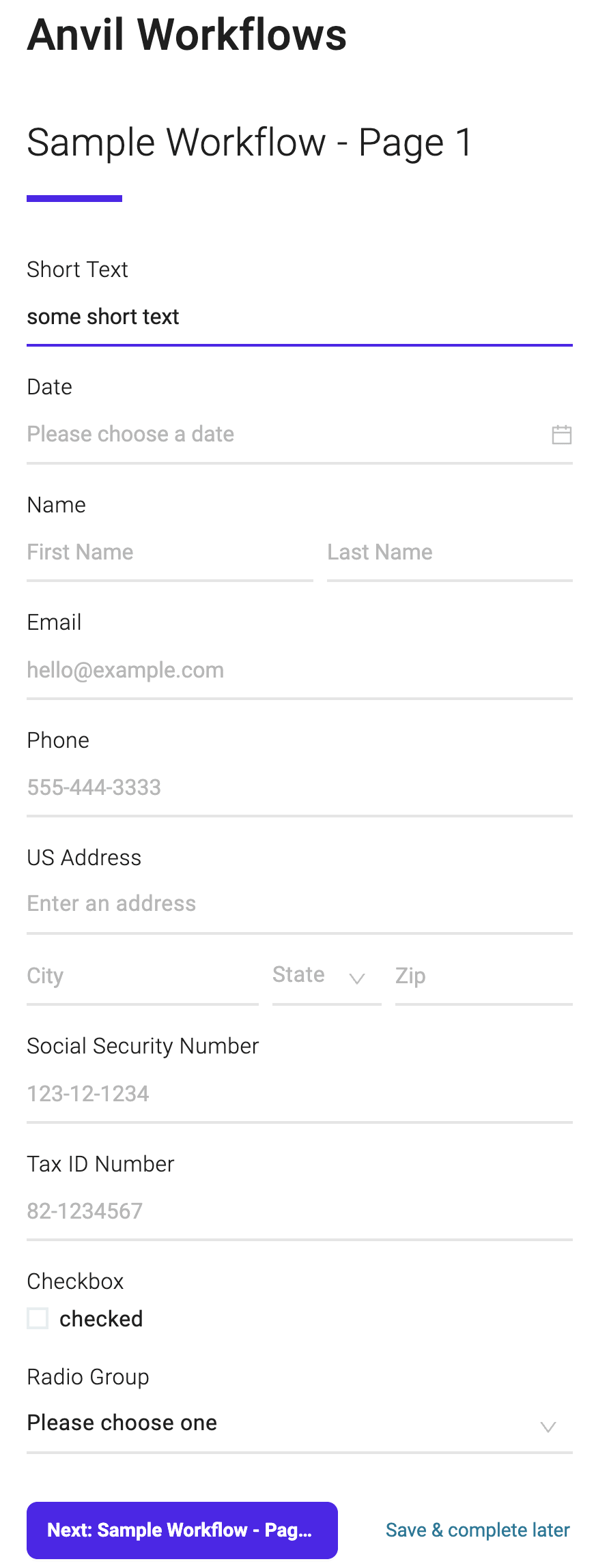 Fully styled Workflow with Material theme
To style your Workflow, we will follow these steps:
- Enable white labeling for your organization. White labeling with custom stylesheets is a Custom plan feature. To learn more, please visit the pricing page.
- Create a custom stylesheet for your Workflow. It needs to be hosted on a publicly accessible URL.
- For testing purposes, we recommend using a service like ngrok Secure Tunnels. This guide will go over how to use ngrok to test your custom stylesheet.
- Apply the custom stylesheet to your Workflow or organization.
- Develop, test, and iterate on your custom stylesheet until you are happy with the result.
- Most of the styling will be done through CSS variables. We have a set of CSS variables and CSS classes that you can use to style your Workflow, but 90% of what you'll want to do is through the root variables.
- Publish your Workflow with the custom stylesheet.
- If you used ngrok for testing, you will need to update the custom stylesheet URL to a publicly accessible URL.
Using ngrok for testing
While developing your stylesheet, it is helpful to have an immediate feedback loop. You can use ngrok Secure Tunnels to quickly test your custom stylesheet from your local machine.
- Download and install ngrok from the ngrok download page.
- If you are a Mac and homebrew user, you can run:
brew install --cask ngrok.
- If you are a Mac and homebrew user, you can run:
- Set up a local server to serve your custom stylesheet.
- You can use create-react-app to quickly set up a local server. Put your custom stylesheet in the
publicfolder, e.g.public/styles.css.
- You can use create-react-app to quickly set up a local server. Put your custom stylesheet in the
- Start a new ngrok tunnel by running
ngrok http 3000in your terminal. Replace3000with the port that your stylesheet is is running on.- If you are using create-react-app, the default port is
3000.
- If you are using create-react-app, the default port is
- Copy the
ForwardingURL from the ngrok terminal output. It will look something like:https://1234abcd.ngrok.app. - Set the custom stylesheet URL in your Workflow settings or org settings to the ngrok URL.
- With the create-react-app example, the custom stylesheet URL would be
https://1234abcd.ngrok.app/styles.css.
- With the create-react-app example, the custom stylesheet URL would be
Enabling Workflow white labeling
You can specify a custom stylesheet injected into your Workflow from the Worfklow settings. This stylesheet can be served from your website giving you full control over the custom styles.
White labeling with custom stylesheets is a Custom plan feature. To learn more, please visit the pricing page.
Once enabled for your organization, you can set a custom stylesheet URL on a per-Workflow basis in each Workflow's settings:
 Individual Workflow settings with custom stylesheet URL
You can also set a default stylesheet URL for your organization in the organization settings. This stylesheet is overrideable on a per-Workflow basis, so you can have a default stylesheet for all Workflows and then override it for specific Workflows.
 Organization settings with custom stylesheet URL
Using CSS variables and anvil-* classes
Now that you have a custom stylesheet URL set for your Workflow, you can start styling your Workflow. We have a set of CSS variables and anvil-* classes that you can use to style your Workflow.
The primary way to style your Workflow is through root CSS variables. Let's add the root variables for colors to your stylesheet:
:root {
  /******** root colors - sets defaults for everything else that are overrideable ********/
  --root-black-color: #222;
  --root-white-color: #fff;
  --root-background: var(--root-white-color);
  --root-text-color: var(--root-black-color);
  --root-brand-color: #6002ee;
  --root-brand-color-10: #b794f6;
  --root-brand-color-20: #efe5fd;
  --root-green-color: #2ed27c;
  --root-green-color-10: rgba(46, 210, 124, 0.4);
  --root-error-color: #e55252;
  --root-link-color: #0185a2;
  --root-link-hover-color: #00a298;
}
Each of the above --root-* variables are fully supported to cascade down to other components. While not required, it is recommended to use --root-black-color and --root-white-color as the values for --root-text-color and --root-background, respectively. This will ensure that your Workflow has a light background and dark text color.
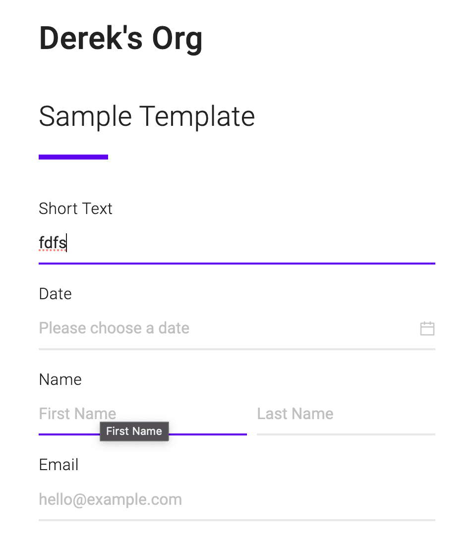
 Only root colors applied to the Sample Workflow
By adding root colors, we have a Workflow that is mostly styled. Before we get into specific components, like buttons, let's set the last few root variables:
:root {
  /******** root colors - sets defaults for everything else that are overrideable ********/
  --root-black-color: #222;
  --root-white-color: #fff;
  --root-background: var(--root-white-color);
  --root-text-color: var(--root-black-color);
  --root-brand-color: #6002ee;
  --root-brand-color-10: #b794f6;
  --root-brand-color-20: #efe5fd;
  --root-green-color: #2ed27c;
  --root-green-color-10: rgba(46, 210, 124, 0.4);
  --root-error-color: #e55252;
  --root-link-color: #0185a2;
  --root-link-hover-color: #00a298;

  /* NEW */
  /******** root typography ********/
  --root-font-family: 'Roboto', sans-serif;
  --root-font-weight: 300;
  /* --root-title-display: none; // this is if we only wanted page titles to show */
}
Sweet, font-family and a slightly thinner font-weight are set. Let's move on to webform pages, buttons, fields to make it pop more.
Webform pages, buttons and fields
After the root variables, the most common components to style are buttons and fields. Webform page components are also highly visible out of the gate.
Let's add some variables for all 3:
:root {
  /* root variables here */

  /******** webform-specific ********/
  --webform-title-font-weight: 500;
  --webform-title-font-style: normal;
  --webform-title-font-size: 32px;
  --webform-page-title-font-weight: 300;
  --webform-page-title-font-style: normal;
  --webform-page-title-font-size: 28px;

  /******** buttons ********/
  --button-border-radius: 8px;
  --button-disabled-background: #f5f5f5;
  --button-disabled-color: #d9d9d9;

  /******** fields ********/
  --field-label-font-weight: 300;
  --field-error-box-shadow: none;
  --field-error-background: transparent;

  /******** field inputs ********/
  --field-input-background-color: transparent;
  --field-input-border: none;
  --field-input-border-bottom: 2px solid rgba(0, 0, 0, 0.1);
  --field-input-focus-box-shadow: none;
  --field-input-padding-x: 0;
}
It is recommended to still apply non --root-* variables to the CSS :root selector. This will ensure that the variables cascade down to all other components. And keep your CSS variables in one spot. You can apply these CSS variables to a class declaration to scope the styles to a specific class/component, but it is not widely used.
You'll notice in the above example there are field-* variables and field-input-* variables. The field-input-* variables correspond only to the input part of a field, not the label or description. This allows you to style the input part of a field; all other aspects of the field, like the label, description, and error messages, will be styled by the field-* variables.
Let's see our Workflow now:
A mostly styled Workflow with Material theme
The mostly styled Workflow looks... identical to the fully styled Workflow. With ~30 CSS variables, the looks and feel of the Workflow can be completely changed.
There are a few more CSS variables used in the Material theme, but we will end here as the process is the same for each supported CSS variable.
If you need more direct control, you can use the anvil-* classes to apply CSS to HTML elements. Here's an example of how to move the error label on fields below the field, using class selectors:
.ant-form-item-has-error
  .anvil-field-content-container
  .anvil-field-help-label {
  order: 2;
  position: relative;
  margin-top: 6px;
  text-align: left;
  padding-left: 0;
  padding-right: 0;
}
The CSS example above uses .ant-form-item-has-error to target fields with errors. While anvil-* classes are the only officially supported classes, you can use Ant Design classes (ant-*) to target specific elements. If we stop using ant-* classes, we will update this guide and provide a migration path.
E-signature packet white labeling
We currently do not have a dedicated guide for white labeling e-signature packets, but the process is identical to Workflow white labeling.
The one major difference is where you specify the custom stylesheet URL. Instead of setting the custom stylesheet URL in the Workflow settings, you will set it during a call the createEtchPacket GraphQL mutation. See the options passed to the createEtchPacket mutation in the Etch documentation.
You can use the same CSS variables and anvil-* classes to style your e-signature packet.
Prebuilt themes
We have a few prebuilt themes that you can use to quickly style your Workflows or e-signature packets. These themes are a great starting point for your custom stylesheet.
You can find the themes in the Anvil Themes repository.
Material theme
The Material theme uses Google's Material Design system as inspiration. It's a great starting point for a modern, clean look.
Here's a couple screenshots of the Sample Workflow, styled with the Material theme:
The top of a Workflow styled with the Material theme
The bottom of a Workflow styled with the Material theme, where your users will submit Webforms or move to the next step
The Workflow white labeling guide will walk you through how to apply the Material theme to your Workflow.
CSS variables
The primary way to style your Workflows or e-signature packets is through CSS variables. We have a set of CSS variables that you can override to change nearly all relevant styles, including pseudo states.
Each variable follows this format:
--<componentName>-<optional>-<optional>-...-<property>
The componentName is the name of the component you are targeting. The optional parts are either subcomponents or specific states the component may be in, like hover or disabled. The property is the CSS property you are targeting.
--root-*
These root variables will allow you to set the base styles for your Workflow or e-signature packet. These variables will cascade down to other components.
You should have a mostly styled Workflow or e-signature packet by setting these variables alone. Start here and then move on to more specific components after getting the base styles set.
--root-black-color: The color value to be used as 'black' in the Workflow or e-signature packet.--root-white-color: The color value to be used as 'white' in the Workflow or e-signature packet.--root-background: The background of the Workflow or e-signature packet. Should be a light color. Recommended to use--root-white-color.--root-text-color: The text color of the Workflow or e-signature packet. Should be a high contrast color to the background. Recommended to use--root-black-color.--root-brand-color: The brand color for the Workflow or e-signature packet. This color will be used for buttons and other primary elements.--root-brand-color-10: The ~10-20% lighter version of the brand color. Used for hover states and other states.--root-brand-color-20: The ~20-40% lighter version of the brand color. Used for active states and other states.--root-error-color: The color of error messages in the Workflow or e-signature packet.--root-link-color: The color of links in the Workflow or e-signature packet. Should be a high contrast color to the background.--root-link-hover-color: The color of links when hovered in the Workflow or e-signature packet.--root-green-color: The color of success messages in the Workflow or e-signature packet.--root-green-color-10: The ~10-20% lighter version of the green color. Used for hover states and other states.--root-disabled-color: The text color of disabled elements in the Workflow or e-signature packet. Background disabled colors will be automatically generated based on this value.--root-font-family: The font family of the Workflow or e-signature packet.--root-font-weight: The font weight of normal text in the Workflow or e-signature packet. Will cascade to titles, buttons, and other elements for other boldnesses.--root-title-display: The display property of the title of the Workflow or e-signature packet.
--field-*
A field is a component in a Workflow or e-signature packet that allows a user to input data. These also include the triggers for dropdowns, date pickers, addresses, and anything that visually looks like an input.
--field-error-background: The background color of the error state of a field. Overrides--root-error-color.--field-error-border-color: The border color of the error state of a field. Overrides--root-error-color.--field-error-box-shadow: The box shadow of the error state of a field.--field-error-text-color: The color of the error text in a field. Overrides--root-error-color.--field-description-color: The color of the description of a field.--field-description-font-size: The font size of the description of a field.--field-help-order: The order of the help text in a field. Set to1to display the help text before the input. Set to2to display the help text after the input.--field-input-background: The background of the input. Overrides--root-white-color.--field-input-border: The border of the input. Overridable by the individual border variables.--field-input-border-bottom: The bottom border of the input.--field-input-border-left: The left border of the input.--field-input-border-right: The right border of the input.--field-input-border-top: The top border of the input.--field-input-border-radius: The border radius of the input.--field-input-color: The color of the input. Overrides--root-text-color.--field-input-height: The height of the input.--field-input-hover-border-color: The border color of the input when hovered. Overrides--root-brand-color.--field-input-padding-left: The left padding of the input.--field-input-padding-right: The right padding of the input.--field-input-padding-x: Horizontal padding of the input.--field-input-focus-background: The background color of the input when focused.--field-input-focus-border-color: The border color of the input when focused. Overrides--root-brand-color.--field-input-focus-box-shadow: The box shadow of the input when focused.--field-label-color: The color of the label of a field. This is the main label, not the optional label or the description.--field-label-font-weight: The font weight of the label of a field. This is the main label, not the optional label or the description.--field-optional-color: The color of the optional label of a field.--field-optional-font-size: The font size of the optional label of a field.--field-optional-font-style: The font style of the optional label of a field.--field-optional-font-weight: The font weight of the optional label of a field.
--button-*
Buttons are used to submit forms, navigate to other pages, or trigger actions in a Workflow or e-signature packet.
While there are many variables for buttons, you will likely need to set only a few to get the desired look. Start with --button-background, --button-color, and simpler/"catch all" variables, and then move on to other variables as needed.
button-background: The background of the button. Overrides--root-brand-color.button-border: The border of the button.button-border-color: The border color of the button.button-border-radius: The border radius of the button.button-color: The color of the button. Overrides--root-white-color.button-cursor: The cursor of the button.button-disabled-background: The background of the button when disabled.button-disabled-border-color: The border color of the button when disabled. Overrides--button-disabled-color.button-disabled-color: The color of the button when disabled.button-disabled-cursor: The cursor of the button when disabled.button-disabled-hover-color: The color of the button when disabled and hovered. Overrides--button-disabled-color.button-disabled-icon-color: The color of the icon in the button when disabled. Overrides--button-disabled-color.button-disabled-icon-hover-color: The color of the icon in the button when hovered. Overrides--button-disabled-hover-color.button-disabled-line-height: The line height of the button when disabled.button-disabled-opacity: The opacity of the button when disabled.button-focus-background: The background of the button when focused. Overrides--root-brand-color-10.button-focus-border-color: The border color of the button when focused. Overrides--root-brand-color.button-focus-color: The color of the button when focused. Overrides--root-white-color.button-font-size: The font size of the button.button-font-weight: The font weight of the button.button-height: The height of the button.button-hover-background: The background of the button when hovered. Overrides--root-brand-color-10.button-hover-border-color: The border color of the button when hovered. Overrides--root-brand-color-10.button-hover-color: The color of the button when hovered. Overrides--root-white-color.button-icon-color: The color of the icon in the button. Overrides--button-color.button-icon-hover-color: The color of the icon in the button when hovered. Overrides--button-hover-color.button-interacted-background: The background of the button when interacted with, e.g. hover, focus, and active states. Overrides--root-brand-color.button-interacted-color: The color of the button when interacted with, e.g. hover, focus, and active states. Overrides--root-white-color.button-line-height: The line height of the button.button-opacity: The opacity of the button.button-padding: The padding of the button. Will be the value for both top/bottom and left/right.button-transition: The transition property of the button.
--checkbox-*
Checkboxes are used to check true/false in a Workflow or e-signature packet. They are a specific type of 'option field'.
--checkbox-border-radius: The border radius of the checkbox.--checkbox-size: The size of the checkbox. Will be the value for both width and height.--checkbox-check-hover-border: The border of the checkbox when hovered.--checkbox-check-hover-border-color: The border color of the checkbox when hovered. Overrides--root-brand-color.--checkbox-checked-background: The background of the checkbox when checked. Overrides--root-brand-color.--checkbox-checked-border: The border of the checkbox when checked. Overrides--root-brand-color.--checkbox-checked-border-color: The border color of the checkbox when checked.--checkbox-unchecked-border: The border of the checkbox when unchecked.--checkbox-unchecked-border-color: The border color of the checkbox when unchecked.
--circle-icon-*
Circle icons are used to display icons in a Workflow or e-signature packet. They also have a button variant, used for clickable icons.
--circle-icon-background: The background color of the circle icon. Overrides--root-brand-color.--circle-icon-border-radius: The border radius of the circle icon.--circle-icon-color: The color of the circle icon. Overrides--root-white-color.--circle-icon-font-size: The font size of the circle icon.--circle-icon-icon: The icon of the circle icon.--circle-icon-size: The size of the circle icon. Will be the value for both width and height.--circle-icon-icon-color: The color of the icon in the circle icon. Overrides--root-white-color.--circle-icon-button-background: The background color of the circle icon button. Overrides--root-brand-color-10.--circle-icon-button-border-radius: The border radius of the circle icon button.--circle-icon-button-color: The color of the circle icon button. Overrides--root-white-color.--circle-icon-button-size: The size of the circle icon button. Will be the value for both width and height.--circle-icon-button-icon-color: The color of the icon in the circle icon button. Overrides--circle-icon-button-color.--circle-icon-button-icon-size: The size of the icon in the circle icon button. Will be the value for both width and height.--circle-icon-button-disabled-background: The background color of the circle icon button when disabled.--circle-icon-button-disabled-color: The color of the circle icon button when disabled.--circle-icon-button-disabled-icon-color: The color of the icon in the circle icon button when disabled.--circle-icon-button-hover-background: The background color of the circle icon button when hovered. Overrides--root-brand-color.--circle-icon-button-hover-color: The color of the circle icon button when hovered. Overrides--root-white-color.--circle-icon-button-hover-icon-color: The color of the icon in the circle icon button when hovered. Overrides--root-white-color.
--content-*
Content components are used to display data in a Workflow or e-signature packet. They are not an explicit field type, but are commonly used with List field types and on review pages.
--content-card-background: The background color of the content card. Overrides--root-white-color.--content-card-box-shadow: The box shadow of the content card.--content-card-margin-bottom: The margin bottom of the content card.--content-card-padding: The padding of the content card.--content-list-item-border-bottom: The border bottom of the content list item.--content-list-item-border-color: The border color of the content list item.--content-list-item-hover-border-color: The border color of the content list item when hovered. Overrides--root-brand-color.--content-title-font-size: The font size of the content title.--content-title-font-weight: The font weight of the content title.--content-title-subtitle-color: The color of the content title subtitle.--content-title-subtitle-font-size: The font size of the content title subtitle.--content-title-subtitle-font-weight: The font weight of the content title subtitle.
--date-picker-*
The date picker ('Date Calender Picker' field type) is used to select a date in a Webform. These variables allow you to style the date picker component.
--date-picker-background: The background color of the date picker. Overrides--root-white-color.--date-picker-border: The border of the date picker.--date-picker-box-shadow: The box shadow of the date picker.--date-picker-color: The text color of the date picker. Overrides--root-black-color.--date-picker-font-size: The font size of the date picker.--date-picker-font-style: The font style of the date picker.--date-picker-font-weight: The font weight of the date picker.--date-picker-controls-color: The color of the date picker controls. Overrides--root-black-color.--date-picker-controls-hover-color: The color of the date picker controls when hovered. Overrides--root-brand-color.--date-picker-days-of-week-color: The color of the days of the week in the date picker.--date-picker-days-of-week-font-size: The font size of the days of the week in the date picker.--date-picker-days-of-week-font-style: The font style of the days of the week in the date picker.--date-picker-days-of-week-font-weight: The font weight of the days of the week in the date picker.--date-picker-footer-button-color: The color of the date picker footer buttons. Overrides--root-link-color.--date-picker-footer-button-font-size: The font size of the date picker footer buttons.--date-picker-footer-button-font-style: The font style of the date picker footer buttons.--date-picker-footer-button-font-weight: The font weight of the date picker footer buttons.--date-picker-footer-button-hover-color: The color of the date picker footer buttons when hovered. Overrides--root-link-hover-color.--date-picker-header-color: The color of the date picker header. Overrides--root-black-color.--date-picker-header-font-size: The font size of the date picker header.--date-picker-header-font-style: The font style of the date picker header.--date-picker-header-font-weight: The font weight of the date picker header.--date-picker-hover-background: The background color of the date picker when hovered. Overrides--root-brand-color-10.--date-picker-hover-color: The text color of the date picker when hovered. Overrides--root-black-color.--date-picker-inactive-color: The color of inactive dates in the date picker. Applied to dates that are not in the current month.--date-picker-today-background: The background color of today's date.--date-picker-today-border: The border of today's date. Overrides--root-black-color.--date-picker-today-border-radius: The border radius of today's date.--date-picker-today-color: The color of today's date. Overrides--root-black-color.--date-picker-today-font-size: The font size of today's date.--date-picker-today-font-style: The font style of today's date.--date-picker-today-font-weight: The font weight of today's date.--date-picker-today-hover-background: The background color of today's date when hovered. Overrides--root-brand-color.--date-picker-today-hover-color: The color of today's date when hovered. Overrides--root-white-color.
--dropdown-*
Any dropdown component in a Workflow or e-signature packet can be styled using these variables. The 'menu' is the part that opens when you click on the dropdown.
--dropdown-menu-background: The background color of the dropdown menu.--dropdown-menu-color: The text color of the dropdown menu.--dropdown-menu-font-size: The font size of the dropdown menu.--dropdown-menu-font-style: The font style of the dropdown menu.--dropdown-menu-font-weight: The font weight of the dropdown menu.--dropdown-option-active-background: The background color of the active dropdown option. This applies when the option is selected or hovered.--dropdown-option-active-border-color: The border color of the active dropdown option. This applies when the option is selected or hovered.--dropdown-option-active-color: The color of the active dropdown option. This applies when the option is selected or hovered.--dropdown-option-border: The border of the dropdown option.--dropdown-option-border-radius: The border radius of the dropdown option.--dropdown-placeholder-active-background: The background color of the active placeholder in the dropdown. This applies when the placeholder is selected or hovered.--dropdown-placeholder-active-color: The color of the active placeholder in the dropdown. This applies when the placeholder is selected or hovered.--dropdown-placeholder-background: The background color of the placeholder in the dropdown.--dropdown-placeholder-color: The color of the placeholder in the dropdown.--dropdown-placeholder-font-size: The font size of the placeholder in the dropdown.--dropdown-placeholder-font-style: The font style of the placeholder in the dropdown.--dropdown-placeholder-font-weight: The font weight of the placeholder in the dropdown.
--dropzone-*
Dropzones ('File Upload' field type) are used to upload files in a Webform. These variables will allow you to style the dropzone component.
--dropzone-border: The border of the dropzone.--dropzone-accept-background: The background color of the dropzone when a file is accepted. Overrides--root-green-color-10.--dropzone-accept-border: The border of the dropzone when a file is accepted. Overrides--root-green-color.--dropzone-active-border: The border of the dropzone when active. Overrides--root-brand-color.--dropzone-add-help-text-color: The color of the add help text in the dropzone.--dropzone-button-disabled-background: The background color of the dropzone button when disabled.--dropzone-button-disabled-color: The color of the dropzone button when disabled.--dropzone-disabled-border: The border of the dropzone when disabled.--dropzone-error-text-color: The color of the error text in the dropzone.--dropzone-file-error-color: The color of the error text for a file in the dropzone. Overrides--root-error-color.--dropzone-or-text-color: The color of the 'or' text in the dropzone.--dropzone-reject-border: The border of the dropzone when a file is rejected. Overrides--root-error-color.--dropzone-upload-button-background: The background color of the upload button in the dropzone. Overrides--root-brand-color-20.--dropzone-upload-button-color: The color of the upload button in the dropzone. Overrides--root-black-color.--dropzone-upload-button-hover-background: The background color of the upload button in the dropzone when hovered. Overrides--root-brand-color.--dropzone-upload-button-hover-color: The color of the upload button in the dropzone when hovered. Overrides--root-white-color.
--esign-*
Variables for styling aspects of an e-signature packet only.
--esign-background: The background color of the e-signature packet.--esign-title-display: The display property of the title of the e-signature packet. Set tononeto hide the title.
--list-*
Lists ('List' field type) are a type of field on a Webform. They allow users to add multiple items to one field.
--list-input-item-content-font-size: The font size of the content of a list input item.--list-input-item-title-color: The color of the title of a list input item.--list-input-item-title-font-size: The font size of the title of a list input item.
--loading-spinner-*
The loading spinner is displayed when the page is loading, or when certain on-page operations happen (like button clicks).
--loading-spinner-color: The color of the loading spinner. Overrides--root-brand-color.--loading-spinner-size: The size of the loading spinner, in pixels. Will be both the height and width of the spinner.--loading-spinner-thickness: The thickness of the loading spinner, in pixels.
--markdown-*
Markdowns are used to display formatted text in a Workflow or e-signature packet, and are often used for page descriptions. These variables will allow you to style the markdown component.
--markdown-background: The background color of the markdown component.--markdown-color: The text color of the markdown component.
--radio-*
Opposite of 'checkbox'. These apply to individual radio options in a radio group, they do NOT apply to any other radio components, e.g. they do not apply to radio buttons.
--radio-background: The background color of the radio option.--radio-border-color: The border color of the radio option.--radio-checked-background: The background color of the radio option when checked.--radio-color: The color of the radio option.
--radio-buttons-*
Applies to the radio buttons component, not individual radio options. Use the 'Radio Buttons' field type in a Webform to use this component.
--radio-buttons-gap: The gap between radio buttons.--radio-buttons-selected-background: The background color of the selected radio button. Overrides--root-brand-color.--radio-buttons-selected-color: The color of the selected radio button. Overrides--root-white-color.--radio-buttons-selected-border-color: The border color of the selected radio button.--radio-buttons-unselected-background: The background color of unselected radio button(s). Overrides--root-white-color.--radio-buttons-unselected-color: The color of unselected radio button(s). Overrides--root-brand-color.--radio-buttons-unselected-border-color: The border color of the selected radio button. Overrides--root-brand-color.--radio-buttons-hover-background: The background color of a radio button when hovered. Overrides--root-brand-color-10.--radio-buttons-hover-color: The color of a radio button when hovered. Overrides--root-white-color.--radio-buttons-hover-border-color: The border color of a radio button when hovered.
--review-data-card-*
The review data card is a component used to display data in a review page. You can find them at the end of a Workflow.
--review-data-card-item-edit-link-color: The color of the edit link icon (pencil) in a review data card item. Overrides--root-brand-colorand--root-link-color.--review-data-card-edit-button-color: The color of the edit button in a review data card. Overrides--root-link-color.--review-data-card-edit-button-hover-color: The color of the edit button in a review data card when hovered. Overrides--root-link-hover-color.--review-data-card-empty-value-color: The color of empty values in a review data card.--review-data-card-empty-value-font-style: The font style of empty values in a review data card.--review-data-card-empty-value-font-weight: The font weight of empty values in a review data card.--review-data-card-empty-value-required-border-bottom: The border bottom of empty required values in a review data card.--review-data-card-empty-value-required-border-color: The border color of empty required values in a review data card. Overrides--root-error-color.--review-data-card-empty-value-required-border-left: The border left of empty required values in a review data card. Overrides--root-error-color.--review-data-card-empty-value-required-color: The color of empty required values in a review data card. Overrides--root-error-color.--review-data-card-empty-value-required-hover-color: The color of empty required values in a review data card when hovered. Overrides--root-error-color.--review-data-card-value-label-color: The color of the label of a value in a review data card. Overrides--root-black-color.--review-data-card-value-label-font-size: The font size of the label of a value in a review data card.--review-data-card-value-label-font-weight: The font weight of the label of a value in a review data card.--review-data-card-value-label-hover-color: The color of the label of a value in a review data card when hovered. Overrides--root-brand-color.--review-data-card-value-label-hover-font-size: The font size of the label of a value in a review data card when hovered.--review-data-card-value-label-hover-font-weight: The font weight of the label of a value in a review data card when hovered.
--webform-*
Variables for styling aspects of a Webform only. Webforms make up a Workflow, so these variables will control the look and feel of a Workflow.
--webform-background: The background color of the Webform. Overrides--root-background.--webform-color: The text color of the Webform. Overrides--root-text-color.--webform-font-family: The font family of the Webform. Overrides--root-font-family.--webform-page-title-color: The color of the page title in the Webform.--webform-page-title-font-size: The font size of the page title in the Webform.--webform-page-title-font-style: The font style of the page title in the Webform.--webform-page-title-font-weight: The font weight of the page title in the Webform.--webform-page-title-underline-color: The color of the underline under the page title in the Webform.--webform-page-title-underline-display: The display property of the underline under the page title in the Webform. Set tononeto hide the underline.--webform-title-color: The color of the title in the Webform.--webform-title-display: The display property of the title in the Webform. Set tononeto hide the title.--webform-title-font-size: The font size of the title in the Webform.--webform-title-font-style: The font style of the title in the Webform.--webform-title-font-weight: The font weight of the title in the Webform.
anvil-* CSS classes
Every supported CSS white labeling class is prefixed with anvil-. While there may be other classes in the Anvil Workflow or e-signature packet, only classes prefixed with anvil- are officially supported for white labeling.
Each class follows this format:
anvil-<componentName>-<optional>-<optional>-...
The componentName is the name of the component you are targeting. The optional parts are additional descriptors that may be used to target specific elements within the component.
If you find an HTML element you need to target does not have a anvil-* class, please let us know! We are always looking to improve our white labeling support. If you need a quick fix, any element with a ant- class can be safely targeted. These selectors are not likely to change, and if they are, we will provide a migration path.
anvil-root
anvil-root: Target all elements in the Workflow or e-signature packet. Similar tobodyin a normal HTML document.anvil-root-page-eyebrow: Target the eyebrow of the page, on both Workflows and e-signature packets.anvil-root-page-title: Target the title of the page, on both Workflows and e-signature packets.
anvil-field
anvil-field: Target all fields.anvil-field-content-container: Target the content container of a field.anvil-field-description: Target the description of a field.anvil-field-help-label: Target the help label of a field.anvil-field-label: Target the label of a field.anvil-field-optional: Target the optional label of a field.anvil-field-input: Target the input of a field.anvil-field-input-prefix: Target the input prefix of a field.anvil-field-input-suffix: Target the input suffix of a field.
anvil-address
Anvil has 2 address components: US and International. You can target each separately, or all addresses.
anvil-address: Target all address components.anvil-us-address: Target all US address components.anvil-intl-address: Target all international address components.anvil-street: Target the street input.anvil-city: Target the city input.anvil-state: Target the state input.anvil-country: Target the country input.anvil-line1: Target the first line of the address input.anvil-line2: Target the second line of the address input.anvil-zip: Target the zip input.
anvil-button
anvil-button: Target all buttons.anvil-button-bar: Target the button bar at the bottom of the Workflow or e-signature packet.anvil-button-bar-secondary-button-container: Target the container for secondary buttons in the button bar.
anvil-checkbox
anvil-checkbox: Target all checkboxes.
anvil-circle-icon
anvil-circle-icon: Target all circle icons.anvil-circle-icon-button: Target all circle icon buttons.anvil-circle-icon-button-icon: Target the icon in a circle icon button.anvil-circle-icon-button-text: Target the text in a circle icon button.
anvil-content
anvil-content-card: Target all content cards.anvil-content-list: Target all content lists.anvil-content-list-item: Target all content list items.anvil-content-title: Target all content titles.anvil-content-title-subtitle: Target all content title subtitles.
anvil-credit-card-input
anvil-credit-card-input: Target all credit card inputs.
anvil-date-dropdowns
anvil-date-dropdowns: Target all date dropdowns.anvil-date-dropdowns-day: Target the day dropdown.anvil-date-dropdowns-month: Target the month dropdown.anvil-date-dropdowns-year: Target the year dropdown.
anvil-date-picker
anvil-date-picker: Target all date pickers.
anvil-dropdown
anvil-dropdown: Target all dropdowns.anvil-dropdown-empty-message: Target the empty message in a dropdown.anvil-dropdown-menu: Target the dropdown menu. This is the part that opens when you click on the dropdown.anvil-dropdown-option: Target all dropdown options.anvil-dropdown-option-description: Target the description of a dropdown option.anvil-dropdown-option-group: Target the group of a dropdown option.anvil-dropdown-option-help-tip: Target the help tip of a dropdown option.anvil-dropdown-option-icon: Target the icon of a dropdown option.anvil-dropdown-option-placeholder: Target the placeholder of a dropdown option.anvil-dropdown-option-value: Target the value of a dropdown option.anvil-dropdown-option-value-parent: Target the parent of a dropdown option value.anvil-dropdown-selected-icon: Target the selected icon of a dropdown.anvil-dropdown-top-message: Target the top message of a dropdown.
anvil-dropzone
anvil-dropzone: Target all dropzones.anvil-dropzone-add-help-text: Target the add help text in a dropzone.anvil-dropzone-uploaded-file: Target all uploaded files in a dropzone.anvil-dropzone-uploaded-file-error: Target all uploaded files with errors in a dropzone.anvil-dropzone-uploaded-file-name: Target all uploaded file names in a dropzone.anvil-dropzone-uploaded-file-remove-button: Target all remove buttons for uploaded files in a dropzone.
anvil-esign
anvil-esign-description: Target the description of an e-signature packet.anvil-esign-finish-page: Target the finish page of an e-signature packet.anvil-esign-page: Target all pages in an e-signature packet.anvil-esign-page-title: Target the title of a page in an e-signature packet.anvil-esign-title: Target the title of an e-signature packet.
anvil-help-tip
anvil-help-tip: Target all help tips.
anvil-list
anvil-list-input: Target all list inputs.anvil-list-input-add-button: Target the add button in a list input. Usually the same as the save button.anvil-list-input-cancel-add-button: Target the cancel add button in a list input.anvil-list-input-item: Target all list input items.anvil-list-input-item-content: Target the content of a list input item.anvil-list-input-item-number: Target the number of a list input item. Appears to the left of the item.anvil-list-input-item-remove-button: Target the remove button of a list input item.anvil-list-input-item-title: Target the title of a list input item.anvil-list-input-save-button: Target the save button in a list input. Usually the same as the add button.
anvil-loading-spinner
anvil-loading-spinner: Target all loading spinners. Appears when the page is loading, or when certain on-page operations happen (like button clicks).
anvil-markdown
anvil-markdown: Target all markdown components.
anvil-option-field
anvil-option-field: Target all option fields (radio fields, checkboxes, etc.).
anvil-pdf-signature-accept
anvil-pdf-signature-accept-field: Target the fields in the pdf on the signing page.
anvil-radio
Traditional radio fields. These are different than anvil-radio-buttons.
anvil-radio: Target all radio fields.
anvil-radio-buttons
These are different than anvil-radio. These are actual button components, used to make radio options a bit more modern. anvil-radio targets the radio options themselves, while anvil-radio targets traditional radio fields.
anvil-radio-buttons: Target all radio buttons components.anvil-radio-buttons-button: Target all radio buttons' individual buttons.anvil-radio-buttons-clear-button: Target the clear button in a radio buttons component.
anvil-review-data-card
This component is used to display data in a review page. You can find them at the end of a Workflow or e-signature packet.
anvil-review-data-card: Target all review data cards.anvil-review-data-card-edit-button: Target the edit button in a review data card.anvil-review-data-card-item: Target all items in a review data card.anvil-review-data-card-item-edit-link: Target the edit link in a review data card item.anvil-review-data-card-item-empty: Target all empty items in a review data card.anvil-review-data-card-item-empty-required: Target all empty required items in a review data card.anvil-review-data-card-item-label: Target all labels in a review data card item.anvil-review-data-card-item-value: Target all values in a review data card item.anvil-review-data-card-item-value-array: Target all array values in a review data card item.anvil-review-data-card-item-value-image: Target all image values in a review data card item.anvil-review-data-card-title: Target the title of a review data card.
anvil-signature-accept
anvil-signature-accept-download-pdf-button: Target the download pdf button on the signing page.anvil-signature-accept-next-button: Target the next button on the signing page.anvil-signature-accept-sign-all-button: Target the sign all button on the signing page.
anvil-tooltip
anvil-tooltip: Target all tooltips.
anvil-webform
anvil-webform-description: Target the description of a Webform.anvil-webform-finish-page: Target the finish page of a Webform.anvil-webform-flow: Target the flow of a Webform. This is the container for all pages, used .anvil-webform-page: Target all pages in a Webform.anvil-webform-page-title: Target the title of a page in a Webform.anvil-webform-review-page: Target the review page of a Webform.anvil-webform-save-and-continue-button: Target the save and continue button in a Webform.anvil-webform-save-and-continue-form: Target the save and continue form in a Webform. Appears in the save and continue modal.anvil-webform-save-and-continue-modal: Target the save and continue modal in a Webform. Appears when the save and continue button is clicked.anvil-webform-step-bar: Target the step bar in a Webform. This is the bar at the top of the page that shows the current step and allows you to navigate between steps.anvil-webform-title: Target the title of a Webform.